Arise Soda Concept Redesign
Reimagining a bold soda brand's web presence with scroll-driven flavor transitions and punchy visual storytelling.
The Problem
After discovering Arise Soda and its high-energy visual identity, I saw an opportunity to push the brand's digital presence further. The existing web presence didn't match the vibrancy and boldness of the physical product. A soda brand targeting a young, active audience needs a web experience that feels as energetic as the product itself — not a template-driven marketing page.
The Approach
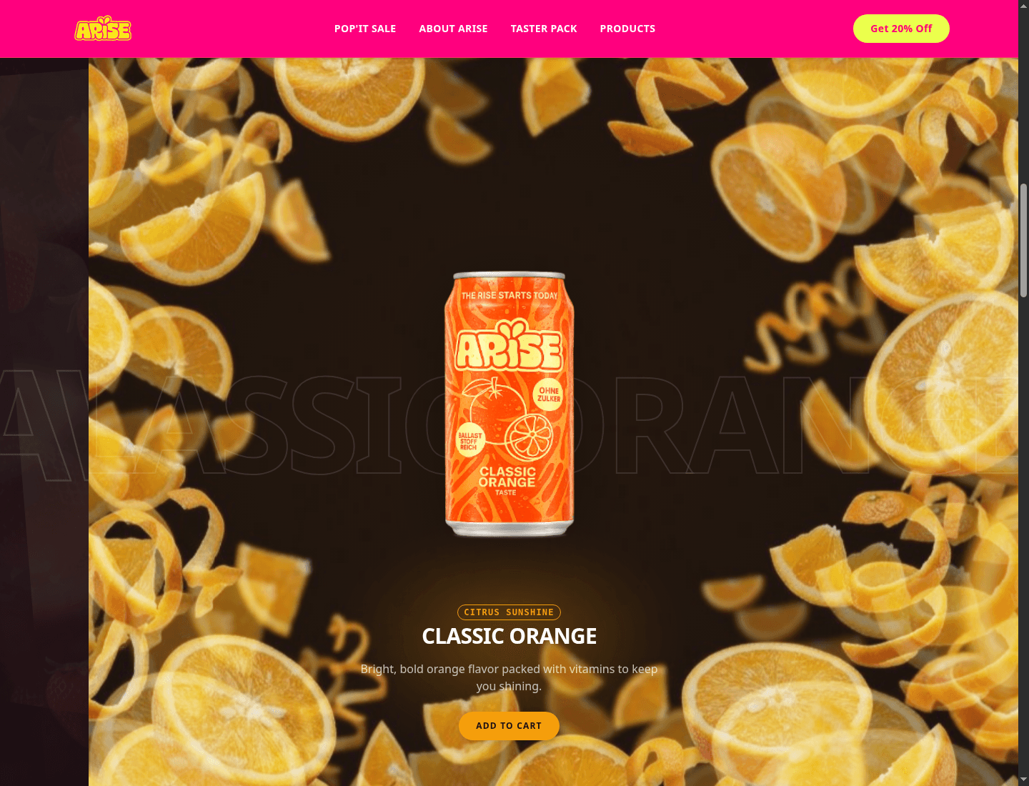
I rebuilt the entire landing page concept around scroll-driven flavor transitions. As the user scrolls, the entire page transforms — background colors shift, product images swap, and typography animates to match each flavor variant (Classic Orange, Berry Blast, etc.). GSAP ScrollTrigger pins sections and orchestrates multi-element transitions, while Framer Motion handles the product card animations and hover interactions. The result feels more like an interactive brand experience than a traditional landing page.
Key Design Decisions
Full-Page Color Transitions Per Flavor
Each flavor takes over the entire viewport — background, accent colors, and even shadow hues shift to match the product. This isn't just a color swap; it's a full atmospheric change. I used CSS custom properties animated via GSAP to create seamless color transitions that feel organic rather than jarring. The effect makes each flavor feel like its own world.
Product Photography as the Hero Element
Instead of burying product shots in a grid, I made the soda can the centerpiece of every scroll section. Large-scale product imagery with subtle 3D rotation effects on scroll creates a sense of physicality — you almost feel like you could grab the can. This approach prioritizes the product over decorative design elements.
Bold Typography That Matches the Brand Energy
A soda brand needs typography that shouts. I used oversized display type with tight letter-spacing and dramatic weight contrasts. Headlines animate in with impact — slamming into position rather than gently fading. The typography treatment mirrors the product's bold, unapologetic personality.
The Results
The concept redesign demonstrates how a bold brand identity can be translated into an equally bold web experience. The scroll-driven flavor transitions create an engaging, non-linear browsing experience that keeps users exploring. This project showcases my ability to take a brand's existing visual language and amplify it for the web.